CBD with its health benefits has become popular and more known in the last couple of years. Therefore, the market for CBD products is very large and we had to find a way to stand out. Most brands try to avoid the topic of Cannabis, but our intention was to explicitly use this inevitable association to create a unique design.
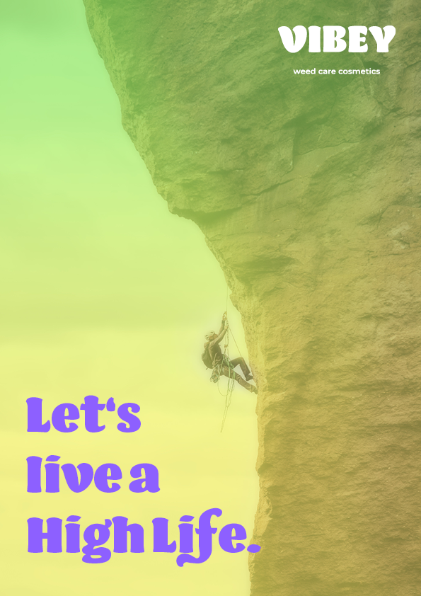
For our client we created the Corporate identity and design from scratch, so this includes the brand name, concept, design parameters, Logo, linguistic usage/expression, slogans and application. Every aspect is based on the flowy, light, free, easy-going and relaxed feeling that is associated with being high.
Team: Lena Murakami, Ronja Stenner, Lea Grabmeier
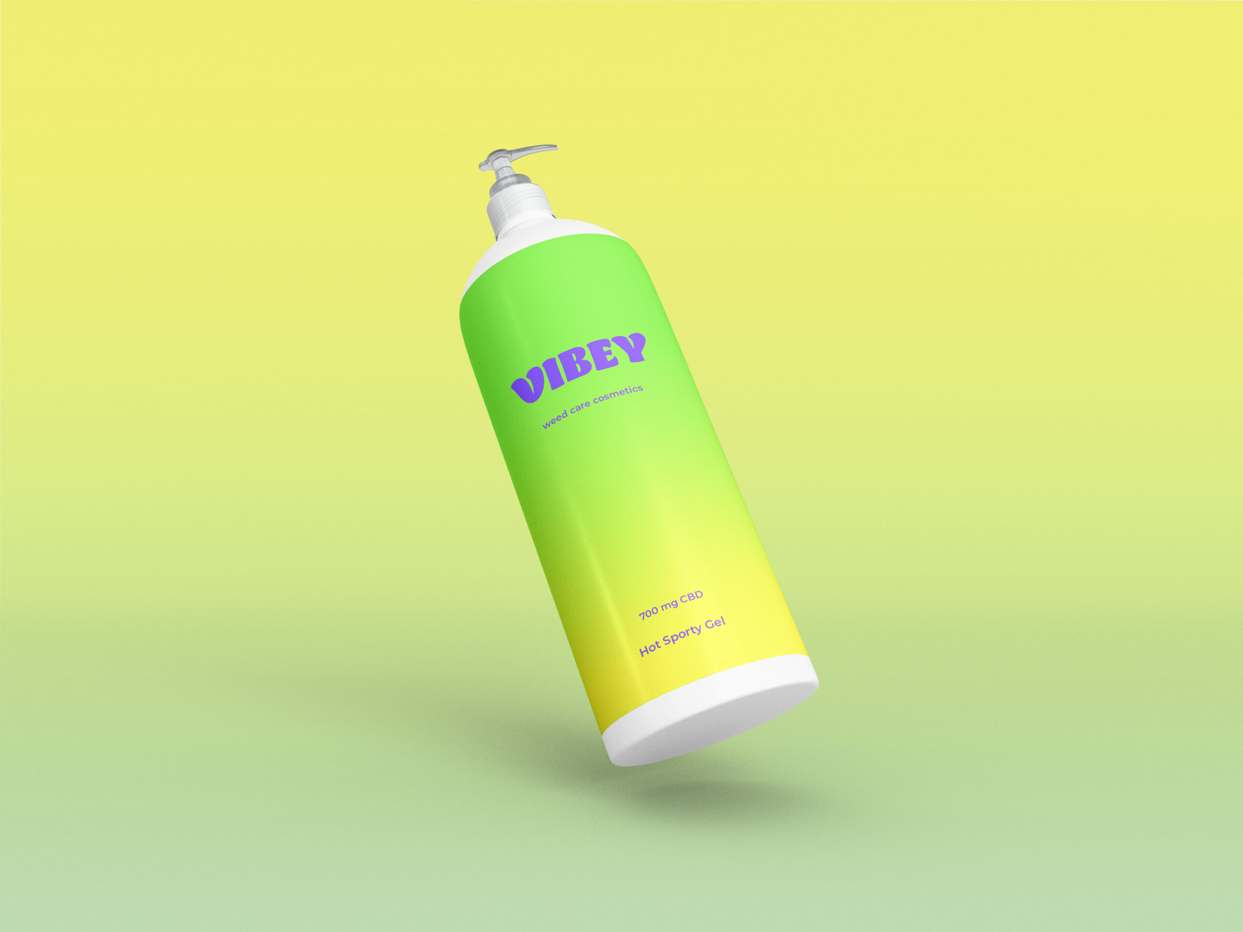
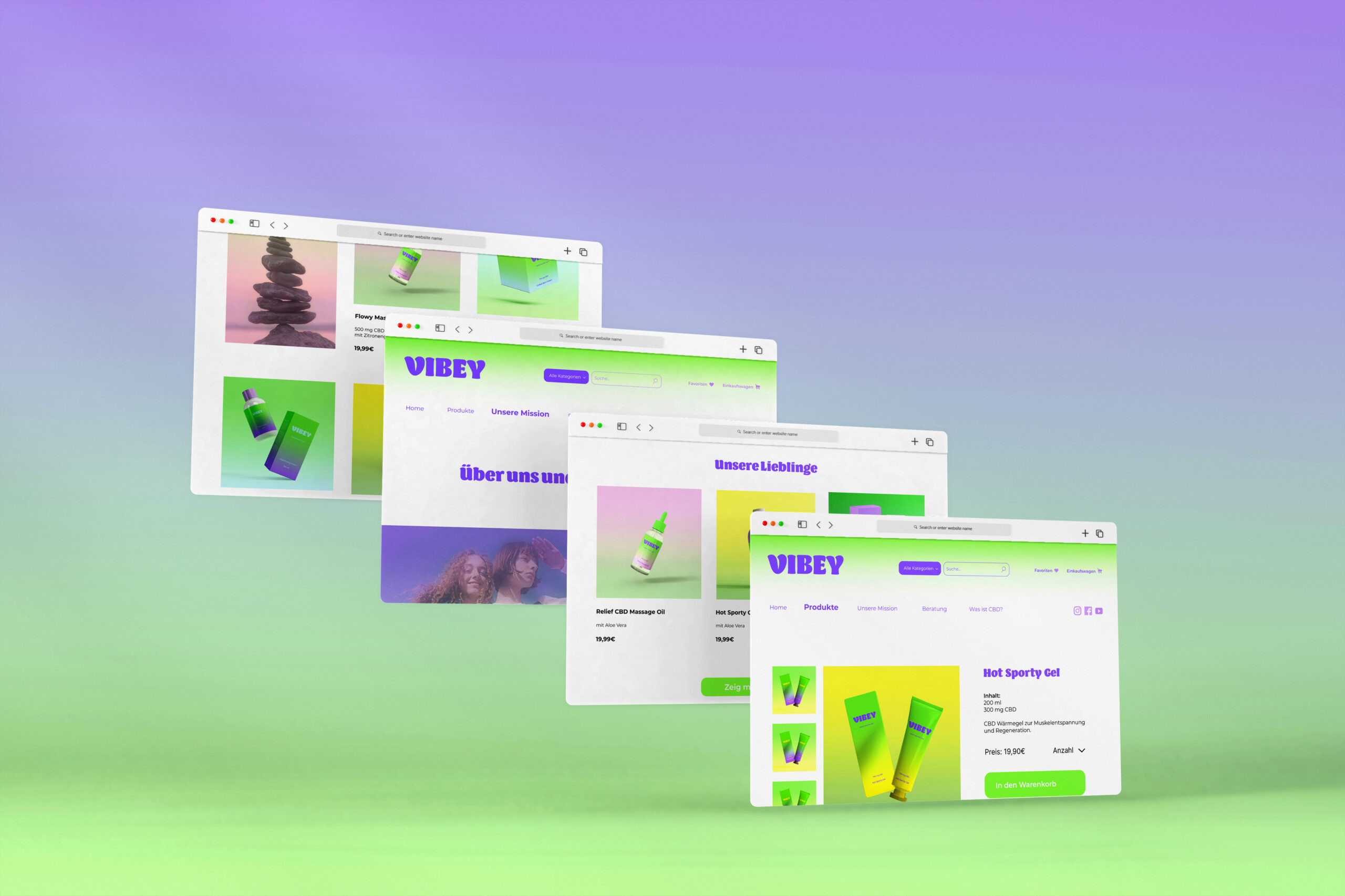
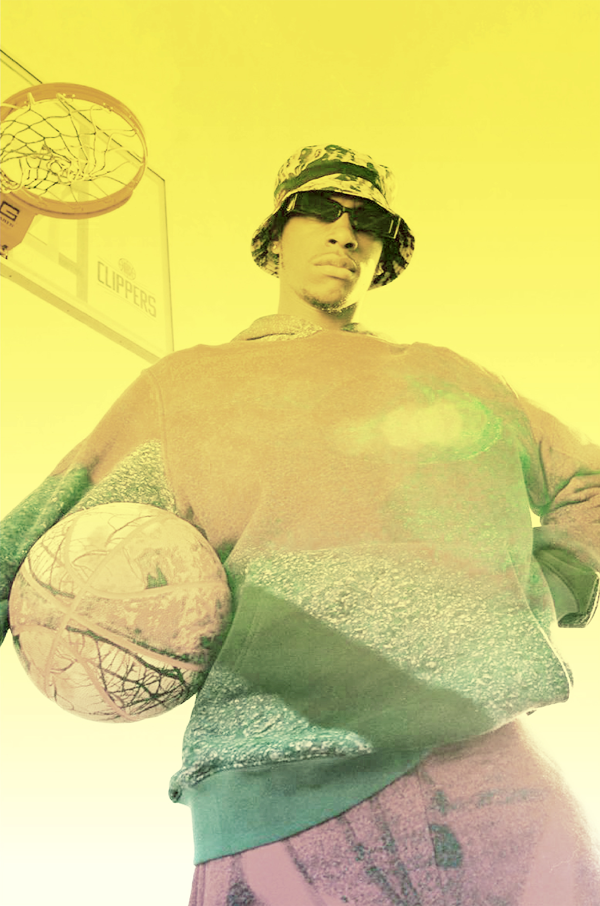
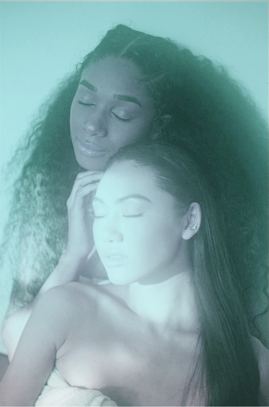
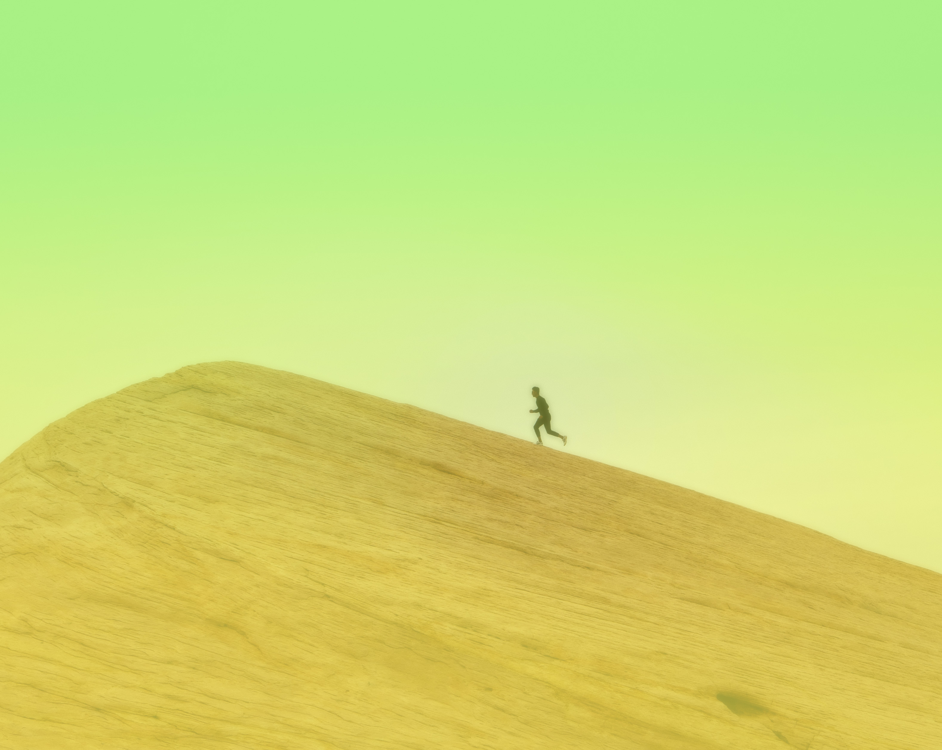
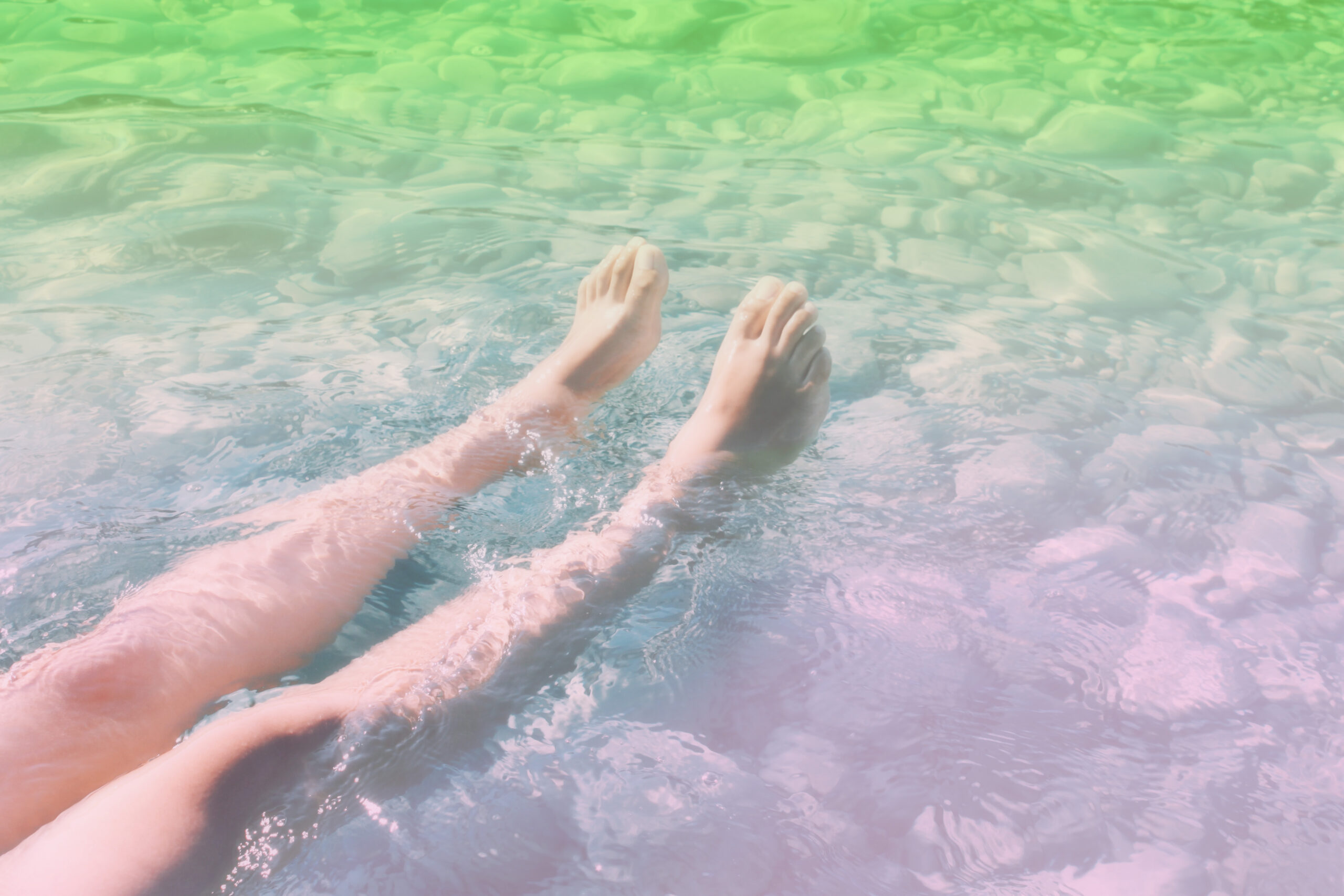
The three product categories: Sport – Wellness – Care
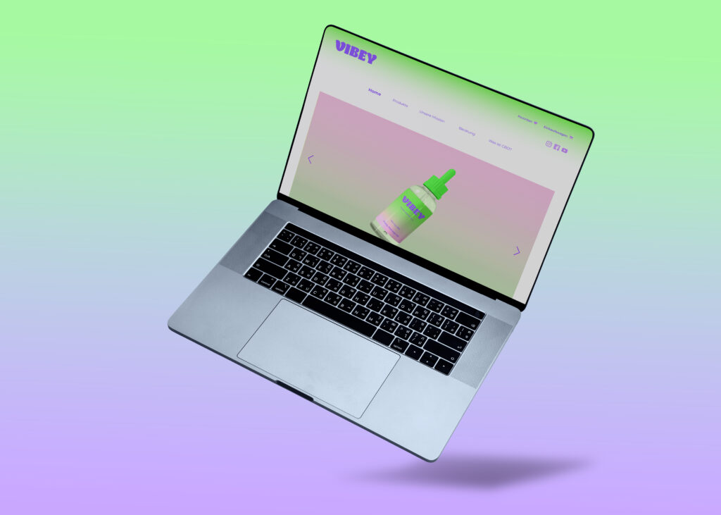
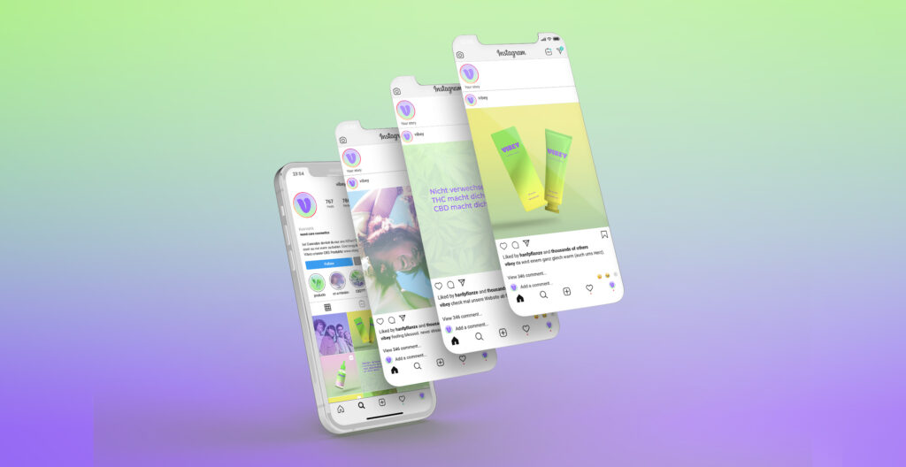
The website and social media:
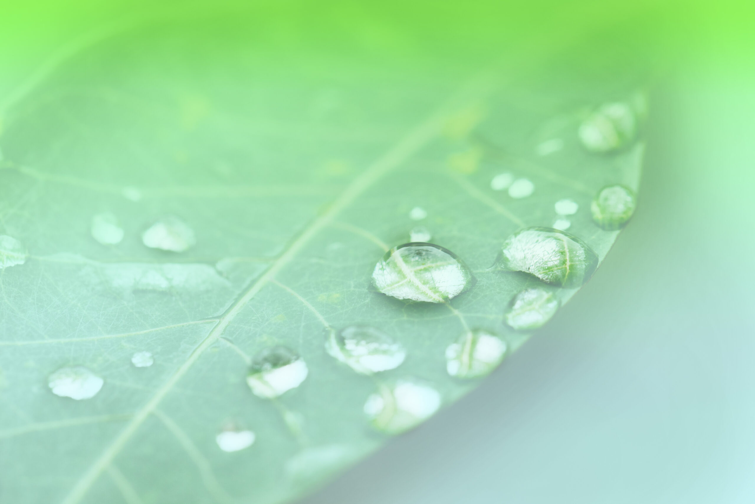
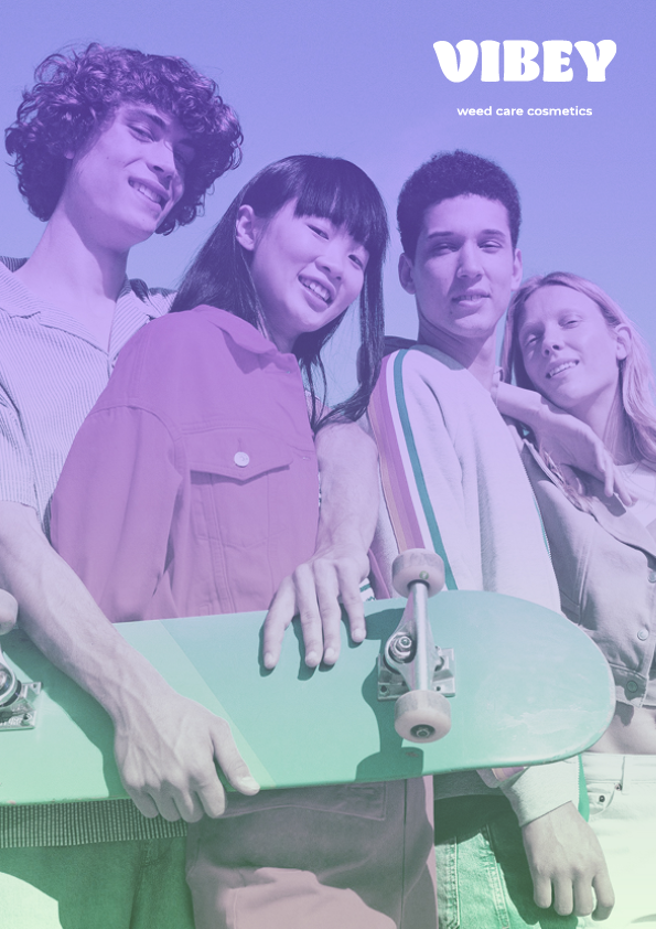
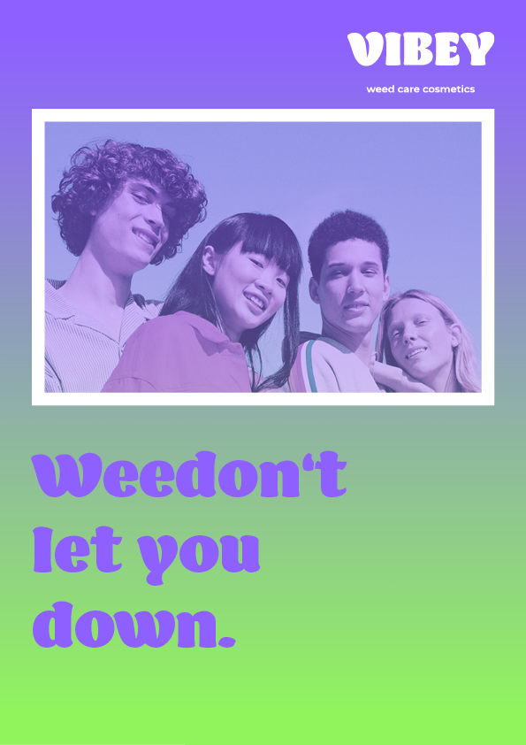
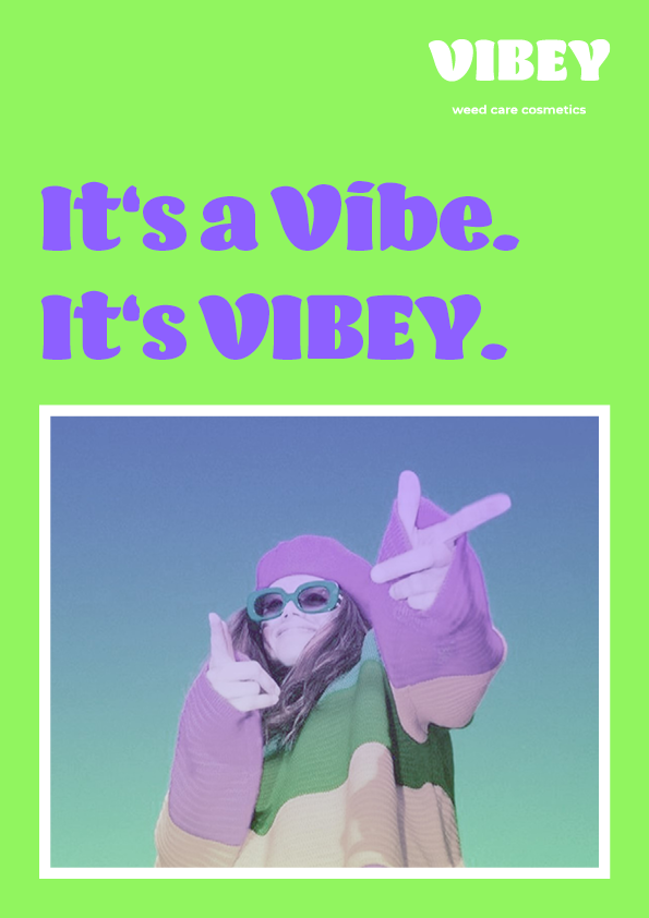
Photostyle: soft, dreamy and unusual
It's a vibe. It's vibey.
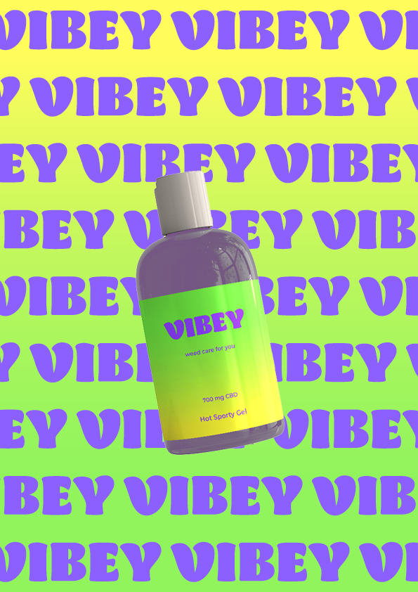
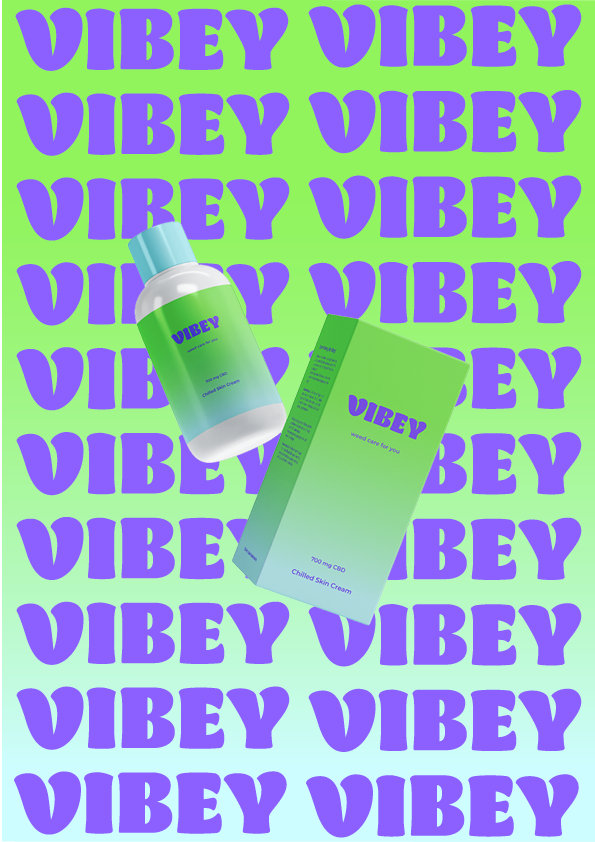
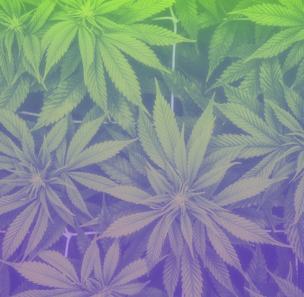
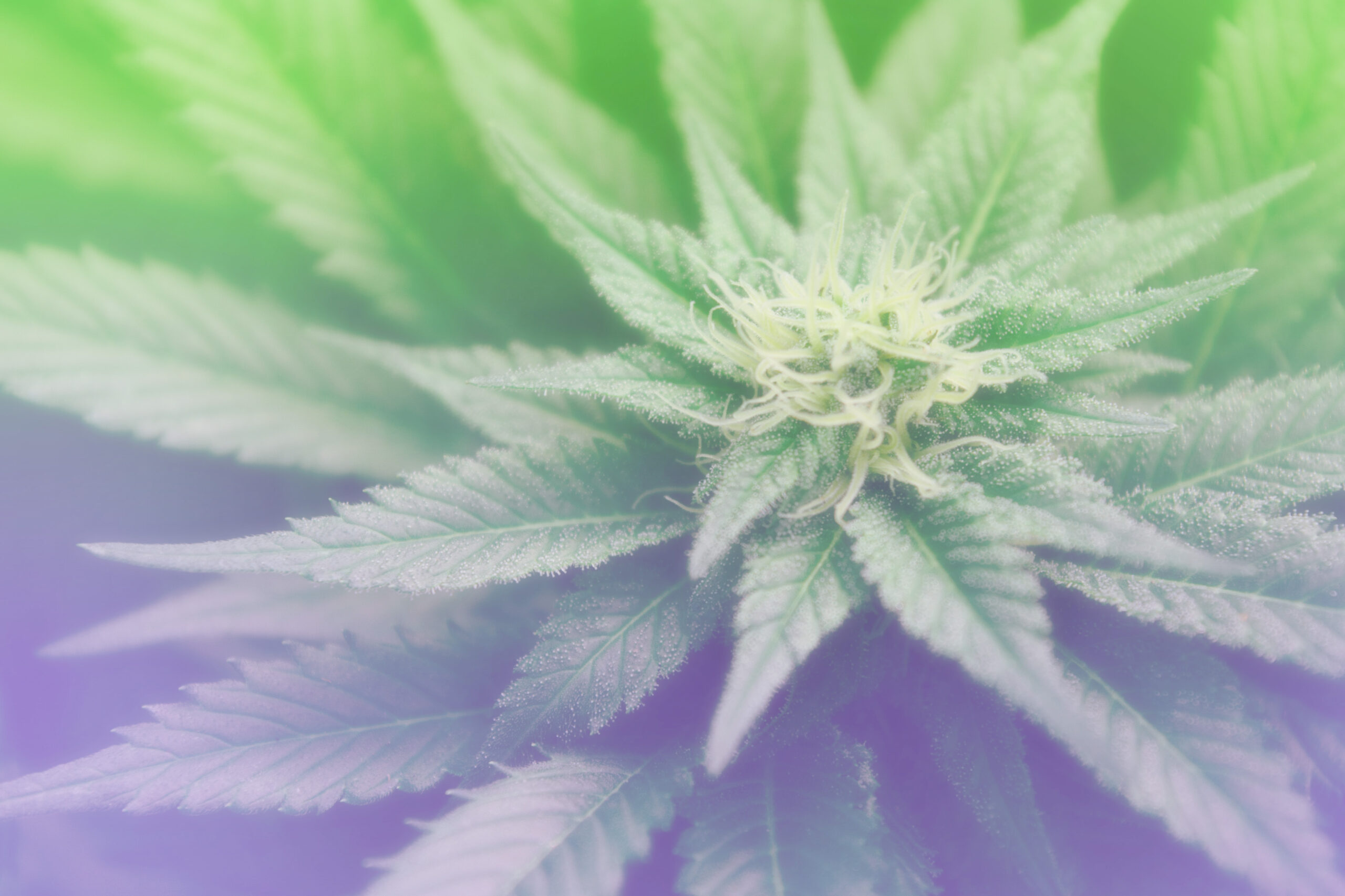
The colors are derived of the different color states of the Cannabis plant, but in a more saturated and vibrant shade. With the gradient a certain lightness is added. The Typography has a flowy and chilled character and can be set in correlation with the free lifestyle of the hippie era. For the brands name we chose “Vibey”, a young and colloquial word, that describes a pleasant feeling, moment or mood and sums up the whole self-image of the brand.